

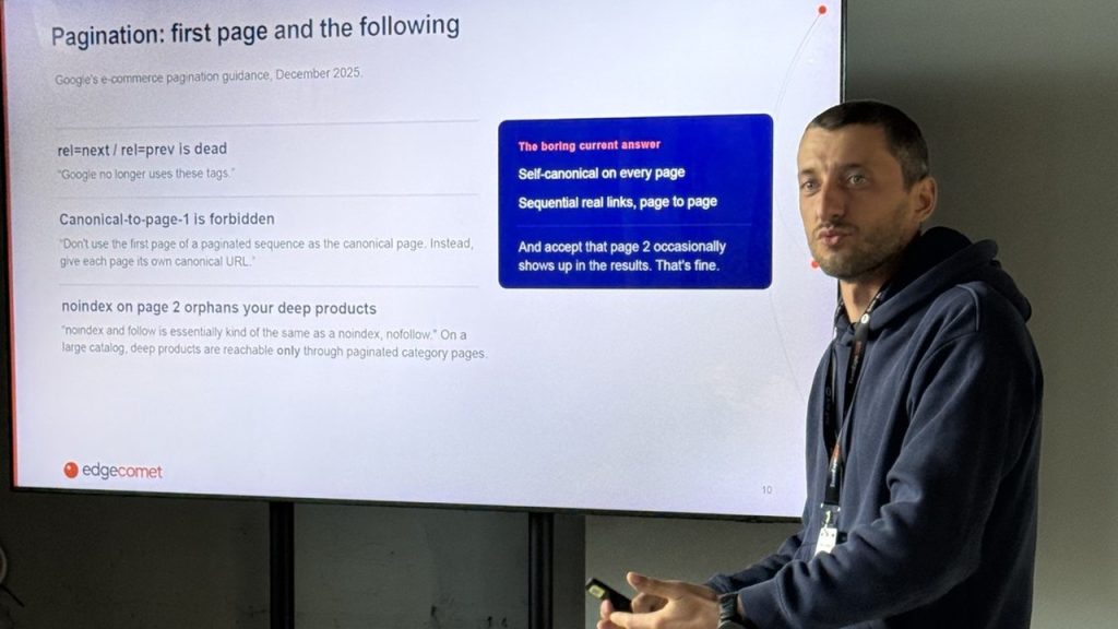
A joint workshop with Serge Bezborodov, CEO of EdgeComet, at EcomExpo in Vilnius on 1 October 2026. I came at it from Comerix.
Every ecommerce website serves several audiences at the same time. Search engines need to crawl it and understand it. AI systems need structured, trustworthy information. Customers expect something obvious to use. Your own team needs a platform they can manage.
Most stores optimise for one of those and quietly break the others. So we took a site apart layer by layer.
Can AI Even See Your Shop?
Serge built his section around three questions that sound simple and are not. Can AI open a page. Can AI read a page. And what are you already offering AI shopping agents without knowing it.
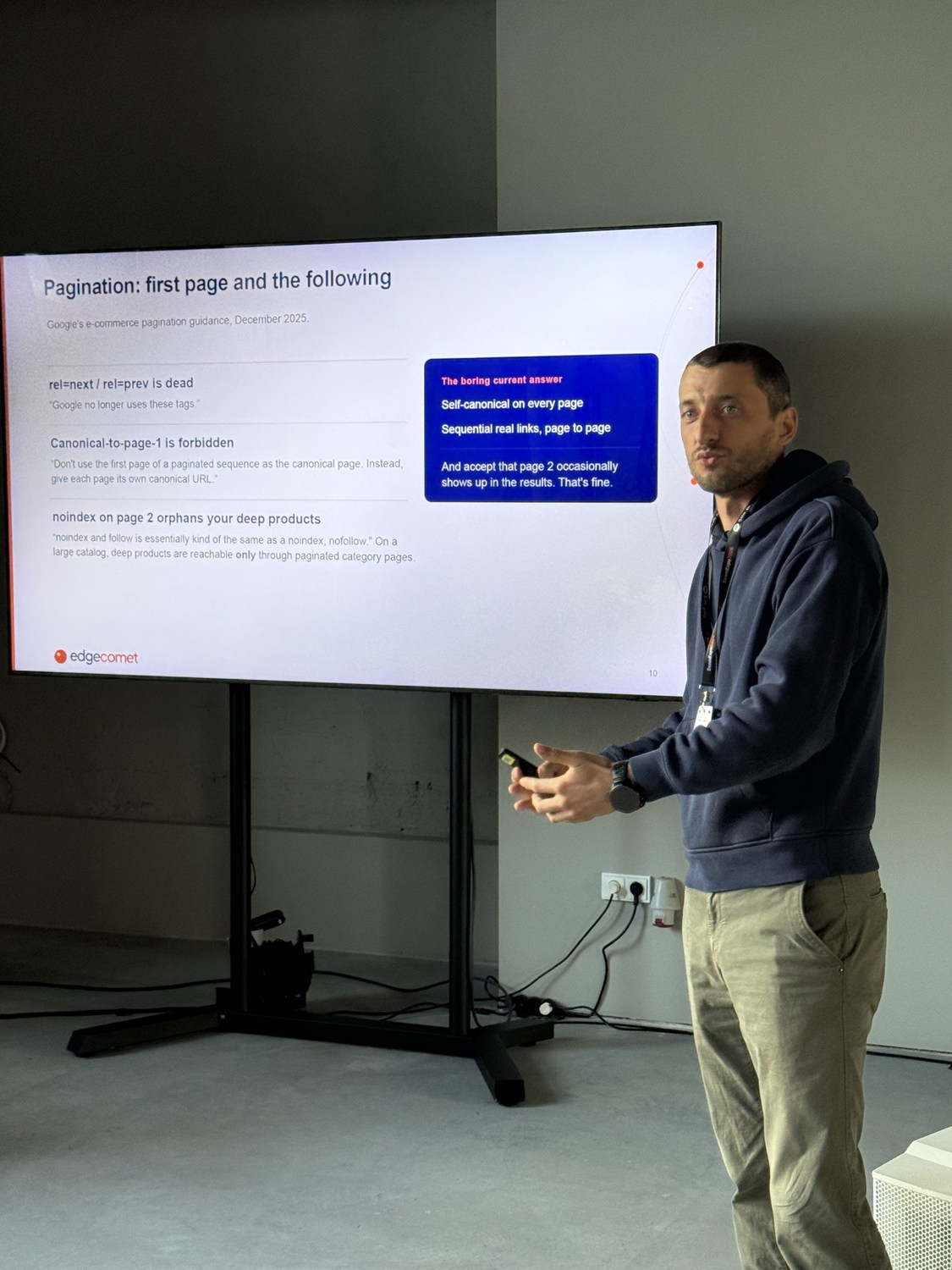
On pagination he went through Google’s ecommerce guidance from December 2025. The rel=next and rel=prev tags are dead. Canonical to page one is forbidden, every page needs its own canonical URL. And noindex on page two quietly orphans your deep products, because on a large catalogue those products are reachable only through paginated category pages.
His answer was deliberately unexciting. Self-canonical on every page, sequential real links page to page, and accept that page two occasionally shows up in results.

Then the number that made the room go quiet. Four filters with ten options each produces 14,641 URL combinations. Five filters produces 161,051. Add sort orders and result pages and you are at roughly four million URLs, for one category. Google’s own guidance says crawling faceted URLs tends to cost sites large amounts of computing resources.
Your real pages are competing for crawl budget against millions of URLs you never meant to create.
What the Customer Actually Does
Not whether a machine can read the page, but whether a human can use it. Homepage, collection page, product page, and what to test at each.
Navigation with menu and search on the left, wishlist and cart on the right. Sticky header, kept active when the user scrolls up. Menus to a few levels, with active offers, contact details and social icons.
On collection pages, sticky filters that show when they are applied, taking around 90% of the screen on mobile, collapsing when a new one opens, ordered by actual usage, with a product count preview. Multi-select on everything if you can.
Paging for the engines, load more for the users. That one line is the whole workshop in miniature. The machine and the human want different things from the same page.
On product pages, title and reviews first, a clean gallery, video if you have it. Savings and special price shown clearly, with availability and a delivery day. Service advantages, returns policy, payment options, bought together. An expert section with a name, a photo and a way to reach them.
Every one of those came with something to A/B test, because none of it is universal. Native versus specialised search. Banner message and CTA. Thumbnails. Infinite scroll. Express payment. Sticky add to cart. In God we trust, everything else we test.
My Slides
Take the Files
The annotated layouts are free to download, along with the UX demos we used on the day.
Figma file: comerix.com/download